Friday, November 13, 2009
First Animation
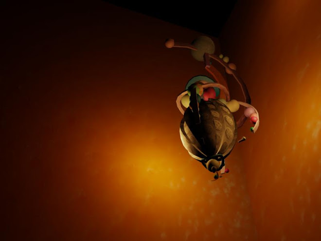
Yay! This is my first animation! I was inspired by a song called "Married Life" by Michael Giacchino, and is a part of Pixar's soundtrack for their new film UP. The bounce and flow of the y is so whimsical, I couldn't listen to it without wanting to move to the beat. Trying to capture motion that was similar to particles being moved in the wind, as well as a sense of randomness was my goal. I am so surprised to see how short 300 frames is...and shocked at how long it took my computer to render the same short animation. Thank goodness I was able to render this :))
Sunday, November 8, 2009
Weekly Journal (11/2-11/8)

Wow another week has gone by! And still I am working on different animations to try and come up with something I like. I am looking to create a spiritual piece to mimic the flow and serenity of water and waves, while also looking at lightening as inspirational. The images below reflect my
searching for inspiration for my own work.
I have been image searching different methods of abstract art for our upcoming animation assignment. This painting with bold colors, flowing lines, and a complete lack of analytical anything makes this image so great to me. I really would like to include this type of style into my animation because I feel it suits my passion and captures a more spiritual side of me. This image can be found at
http://www.paintingsdesign.com/images_art/abstract-art-1.JPG

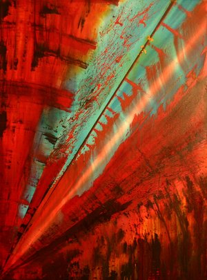
Dream by D. Lane Taylor is pure inspiration to my eye. The blast of color, use of space and movement is captivating. The intrusion of green into red mimics the need for chaos to inspire change. Color can be just as important as shape and even more so than line. This image is from
http://abstractexpressionism.files.wordpress.com/2007/07/dream_by_blast3r.jpg

Sunday, November 1, 2009
Weekly Journal (10/25-11/1)

I found this image, while looking for simple and yet whole image. Despite its simplicity, the design was just beautiful. Unlike many other complicated images I have been looking at recently, like movie trailers with CG effects, this picture was unique in how
clear and clean it is. I found it inspiring in how, basic parts of a scene are put together to form a solid piece, and yet there is no clutter. This picture came from...
http://dryicons.com/files/graphics_previews/midnight_symphony.jpg

Personally, I have found a theme of night, and midnight very interesting…maybe it is all due to Halloween. Well, I have played this song over and over again. Although I have never been a hardcore Airborne Toxic Event fan, I am a major fan of their song “Sometime Around Midnight.” Music is a huge inspiration for me, and I just thought I would finally share it. The image I have posted for this is the album cover for this song and its CD. The image is from
http://www.cashboxmagazine.com/covers3/airbornete_airbornete.jpg

Okay so here is another simple yet elegant image that I found on the Internet to go with my nighttime theme. The leaves falling from the sky and into the rippling water, is awesome in its own way. Simplicity seems to be a trendy design concept that can appeal to a wide variety of fans, because once details are added the window of appeal shrinks. To check out this image and its site go to
http://www.feelneed.com/Images/Good-Night/images/Good-night-hi5-16.jpg
And of course, I had to look up images from Transformers. I was impressed immediately with the graphics in the film. I couldn’t believe that they could just generate all of the extra metal needed to create the actual transformer from the car, and have it appear believable. The animation along with the harsh metal sound effects was great. The image I have posted is also just to demonstrate the attention to detail in shadows. I found this image at
http://img91.imageshack.us/img91/7497/trans07hy2.jpg
Oh and this is my sketch for the week. I find I am better at intertwining curves and curls. So this is it!

Sunday, October 25, 2009
Weekly Journal (10/19-10/25)


This week was probably the most fun and challenging yet. I feel like I’m getting close to really being able to use 3D Studio vs. just avoiding it. Watching more and more tutorials, as well as just playing around in the program has been most helpful by far. I have already created my light fixture’s shape, and all that is left is just adding texture and lighting, which will probably be more challenging and best left as something to take the whole week to finish.
My sketch for this week was fun and started with just the flower. I figured I should try adding more to the picture than the floral detail. A studio art class would be much appreciated, being that I have such a mental block when it comes to sketching faces.
I have been so interested in all types of light that we take for granted in every scene we enter on a day-to-day basis, that I started looking up interior designs. Not only is there direct lighting that lands on walls, and furniture, but many basic light sources that illuminate a room. The room pictured above shows great scalloped lighting on the walls as well as multiple overlapping light sources that create the scene. Shadows in this picture caught my attention, they, along with lighting, tend to be taken for granted…this is for sure something that is going to take so much practice, and research! Speaking of research, this picture came from:
http://www.pro-design-interiors.com/images/interior%20design%20pic1.jpg
The final picture of the eye I thought was just amazing! This photograph includes ideas of texture, rhythm, and detail. It is the little things in a picture that make it believable, and they are also the most tedious to get right. This image came from:
http://farm4.static.flickr.com/3165/2848444141_8d4425a1c1.jpg
Sunday, October 18, 2009
Weekly Journal (10/12-10/18)


This week has been interesting, with an emphasis on frustrating. I seemed to have continually bought the wrong software, and nearly fried my laptop. I really just need to find a good software system to run bootcamp and install 3D studio. I really want to mess around with it to try and get somewhat of a handle on the whole thing. Just keep searching, that’s all I can do. I know it will be fun, as soon as I get all of the mess shuffled through. Thankfully inspiration came easily this week. All photos listed caught my eye and came to me almost instantly. Check ‘em out!
My sketch for the week was done in all pen. I guess it is more of a doodle, but this is the type of design that comes to mind whenever I sit down with a blank sheet of paper. I think they look tribal in their own unique way. I would like to include a design like this in my lighting fixture for the new assignment.
So lets just say I have been looking around for some ideas when it comes to the upcoming lighting assignment. There are so many different styles out there! Antique, modern, odd, quaint, and so many more lighting fixtures filled up the page for my online searches. These pictures above were some of the most interesting as well as a great example of the diversity I found. Despite how full the lighting fixture appears in the upper left corner, I think it is my favorite, because of the shadows and shapes involved. Also that particular fixture contrasts nicely with the simple sphere below it. This picture came from:
www.mocoloco.com/archives/004567.php
I just thought this was so neat! A tunnel of led lights would be so awesome to walk through. The lighting creates dimension, depth, and shape unlike many things I have seen before. Despite the thousands of lights in this tunnel, there is no bright light overall. Dim and dark, this light tunnel seemed so awesome. To see the site this was from go to…
http://somethingsiknow.files.wordpress.com/2009/09/led_lighting_a.jpg
Sunday, October 11, 2009
Weekly Journal (10/5-10/11)


3D Studio seems like such an intense program. There are so many more options, especially with perspective that just change everything for the better. Having four sections on the screen visible at the same time eliminates many difficulties that I ran into with SketchUp. I am still trying to find the downloads for my computer, but I’m sure with just a little bit more hunting, I’ll be able to find it…or at least I hope so. For now, I am spending quite a bit of time just watching tutorials for 3D Studio, to get a better feel for the program. However, I think that just practice, through assignments, and messing around will help the most.
This first image is my sketch for the week. I find that when I just sit down to sketch my mind goes blank and nothing but the same old images cross my mind. Although I don’t have great sketches by any means, I am having so much more fun just sketching the second an idea pops into my head. A bird just falling off a cliff seemed too tragic, so I felt a safety net would be a decent compromise. Plus the little bird following after its mother made it that much more quirky.
The second image is one by an Australian artist, Erna Motna. Because we are getting into 3D stuff I have been looking at and valuing perspective so much more than before. To me, this image was totally unreadable. But after doing a little bit more searching I found that it depicted an aerial shot of fires, hunters, and animals. It is so interesting how differently; cultures portray various scenes from their everyday lives. Being able to think differently helps an individual stand out, and make a difference. This picture is from http://www.gallerieaustralis.com/cms_resources/GAEM88001.jpg
Finally I have one of my favorite Escher pieces posted. His work is all about perspective and eye tricks. Stairs that blend with walls and ceilings perfectly are at first believable, then obviously mind boggling in how it somehow comes together. Again, a whole new take on perspective changes everything in this image to make it bizarre, unique, and interesting beyond compare. I found this MC Escher piece at http://stark.udg.es/~emili/docent/diversio/escher/Treppenhaus.jpg
Saturday, October 3, 2009
Weekly Journal (9/28-10/4)


Yay! 3D Modeling!! Despite how frustrating it can be, I am really happy to be doing this. I keep watching tutorials and searching the help bar countless times, and I think I am starting to, barely get the hang of this.
My sketch for the week was more random than anything. It reminds me of a mix of the camera commercials with the multiple frames and Alice in Wonderland. My sketches are not improving as much on the technical side of things, but I am noticing a difference in the creativity or thought I put into them.
Searching Google numerous times I found this picture of the Pixar birds, and thought it was so cool! There are many more concept images such as this one, on the web site listed below. These pictures highlight the design process for many of Pixar's films such as The Incredibles, Monsters Inc., and several of their short films. Check out this image and others at http://images.google.com/imgres?imgurl=http://newsimg.bbc.co.uk/media/images/41120000/jpg/_41120726_birds.jpg&imgrefurl=http://news.bbc.co.uk/nolpda/ifs_news/hi/newsid_4527000/4527948.stm&usg=__1Li2ErLXgo_1OSVULins1yxwGZQ=&h=300&w=416&sz=42&hl=en&start=10&um=1&tbnid=5AUyAa5Fhv__vM:&tbnh=90&tbnw=125&prev=/images%3Fq%3Dpixar%26hl%3Den%26client%3Dsafari%26rls%3Den-us%26sa%3DN%26um%3D1.
And in between all of my Google searching of tutorials and help in 3D modeling I found this image which was really inspiring. The use of shadows and lighting, and the various material patterns used makes this image more realistic. Now my chair is nowhere near as complex but still I am proud that I was able to get it done. I can only go up from where I am at now, and an image like this would be an ideal piece to create. This image came from http://images.google.com/imgres?imgurl=https://blogger.googleusercontent.com/img/b/R29vZ2xl/AVvXsEiDGTEQj0QH1UIHjv2xiV7rIMcMxDlm0c0MLX6VFPvMw9pk8IDZG4ce_YxJjRhNs0mrFw8IcmTZvLeZVvf0g27ozw2MLbZMJ8ldrWUOWzLf_nDOr8OzxJ9ztnQKBO6jb668HApA_nYr2lwZ/s400/Interior_07_16_07.jpg&imgrefurl=http://dearasis.blogspot.com/2008_02_01_archive.html&usg=__zAiNQGoIuYbQQPo-lz8MXXaezZQ=&h=276&w=400&sz=28&hl=en&start=9&um=1&tbnid=-ZUvsoSu_82sRM:&tbnh=86&tbnw=124&prev=/images%3Fq%3Dsketchup%2Bmodels%26hl%3Den%26client%3Dsafari%26rls%3Den-us%26um%3D1
Subscribe to:
Posts (Atom)


